Since 2019 we have seen a wave of car manufacturers rebranding, and going in a very similar direction. The first question that pops up is-obviously- why?
And there is a clear answer that we will check out together. Everything is going digital, and for the digital world accessibility and legibility is key.
When talking about car brands, there are many different use cases for their logo: The actual symbol placed physically on the front (and sometimes back) of the car, the website, app and every digital asset, and the other smaller stuff, like being placed on the shield of a car mechanic business.
So Let´s take a look at a few different car brands and see what they have done. Since this is a personal blog, it will be full of personal opinion, and you are allowed to disagree. But, the trend is very clear. Everyone is going flat. Well, almost everyone.
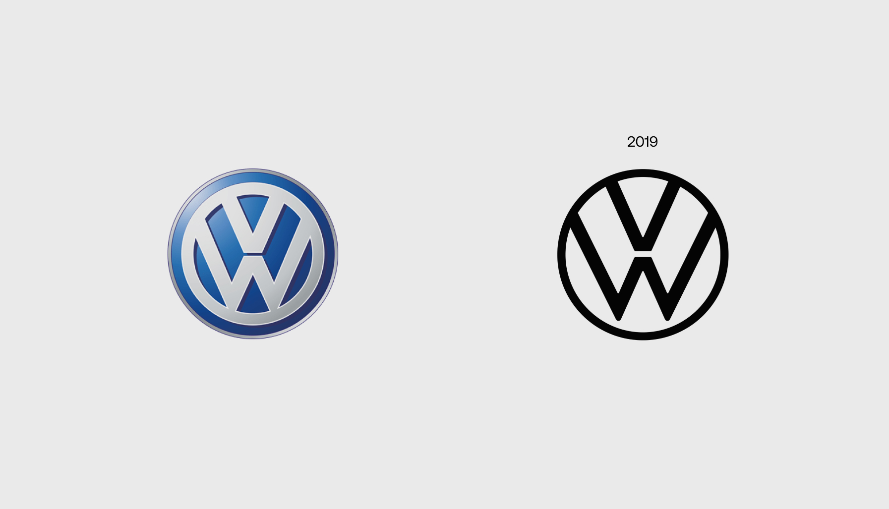
Volkswagen is one of those cases where they decided to keep as much as possible from the original logo. On the left there is the logo you all will recognize. It was around for many years, and it was a classic brand, quickly recognisable for its blue gradient behing and the letters V and W on top of the other.
They definetly went flat, reducing the lines to its basic shape: a circle, containing the two letters in the classic and distinct way.
The changes: Thiner lines, only one circle, and a bigger gap between the V and the W.
Personally I really like it. It works perfectly in the digital world and after seen it in the new cars it works perfectly as well. As we can see in the new VW prototypes lots of thin lines are being used in other places like the front lights and some side lines in the general design, so I have good hopes for it.
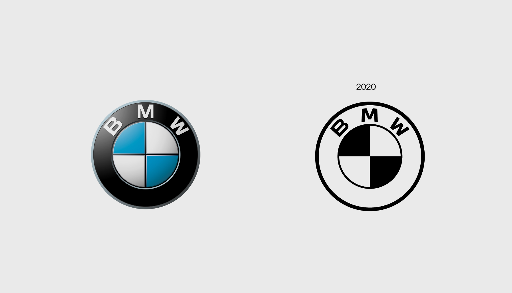
This case is also very interesting. As most car companies in the past the style of their symbol was based on the physical thing. It worked the other way around, you wanted to make the logo look as real as possible, and every brand added a 3d quality that made that style happen. In other brands you would see shiny coated chromatic shapes, but bmw went for a smoother way, with a Mate style that the vast majority loved.
Now we are in this flat design era and BMW participates as well. They kept most of the old stuff, the thickness of the lines, the size and spacing of the letters, and obviously the bavarian skyblue checkered flag, reduced in the black and white version for obvious reasons. Works well in the digital world and keeps the heritage that such a brand needs.
Again, I have to say I agree with this design desition. The whole idea of branding is trying to make it timeless, and this could be it.
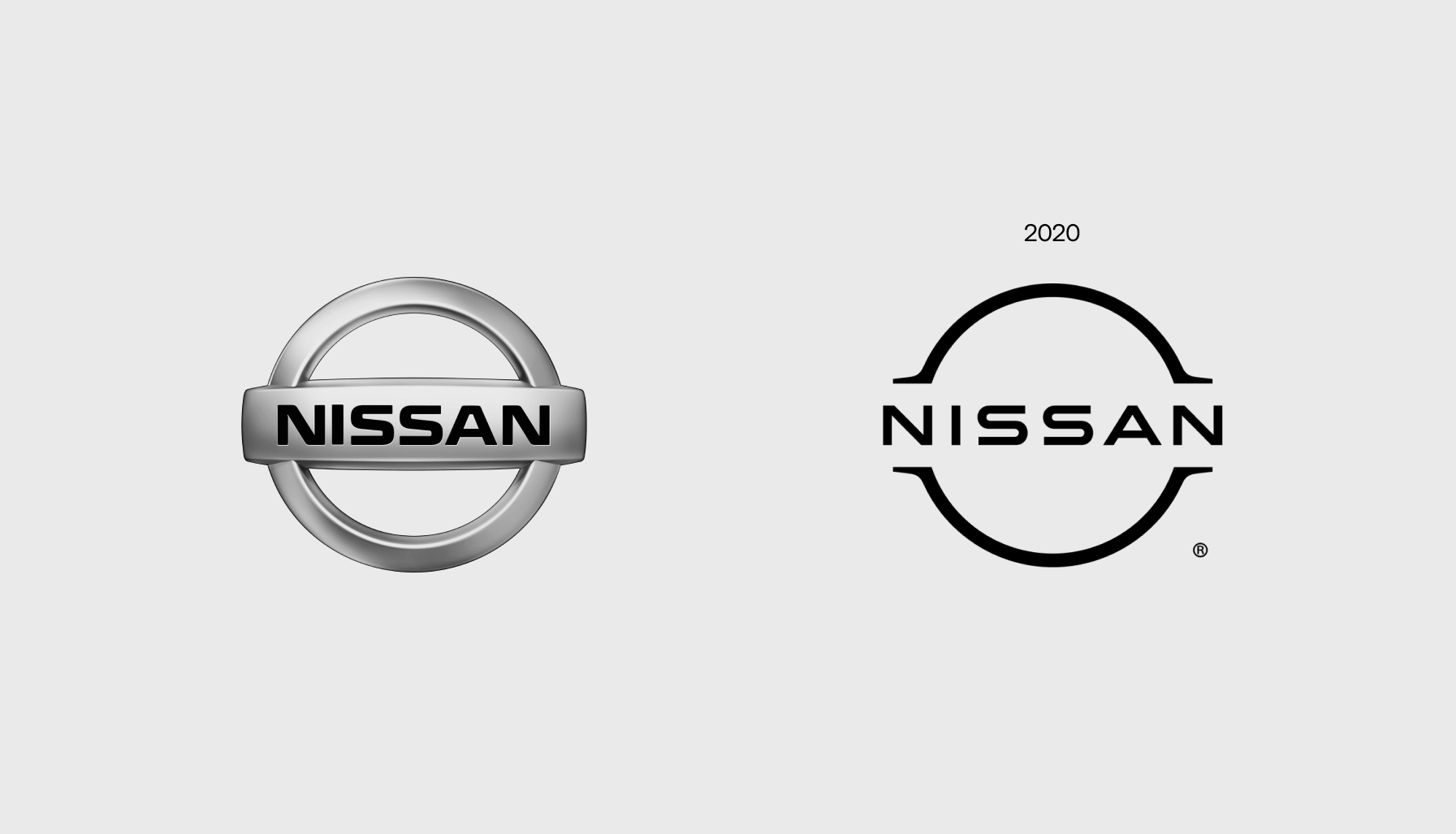
Nissan hadn´t change their logo much since 1988. The whole concept is the same. A circle with the Nissan wordmark in the center, using a container wich made it easier to make it a "one piece" thing in the physical world, that you can just put in the hood plate. So, for the redesign they did something interesting. The circle is there, the wordmark, bigger and with a bit more letter spacing, is there, and that container that after a while became a distinctive element differencing the symbol from the other million logos in a circle, was transformed into four small lines that have the job of hinting that the text is held by something. In the digital world works much better. You can now use it in the white version, over a dark night-in-the-city photography, like the cool kids do.
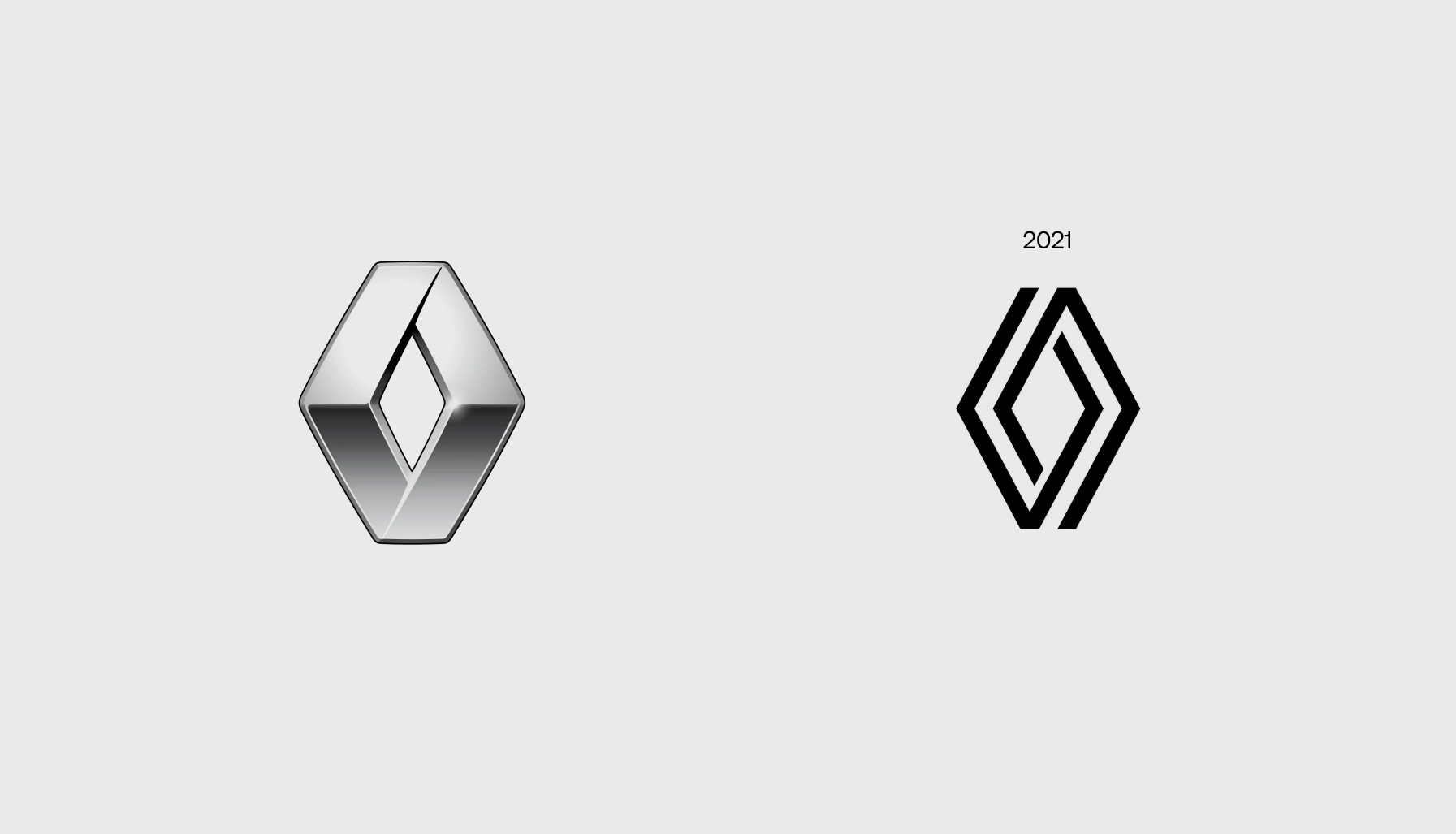
The french manufacturer didn´t want to miss the train and together with Dacia (read more later) they updated their identity, focusing on the new electric world that was expecting them. The idea is pretty simple. How can we keep the diamond shaped symbol but in a modernized way, without loosing a bit of identity? Let´s try with two lines not connected to each other. It gives the same illusion concept of an infinite imposible ribbon. It reminds me of the Penrose triangle (The impossible triangle), but made flat.
My opinion: I struggle a bit to think why they left that spacing between the lines. I guess connecting them didn´t give the same ribbon idea, but it´s a bit weird that is a smaller spacing than the gap between the other lines. Don´t love it, don´t hate it. It will problably one of the first symbols to be updated again in the next five years.
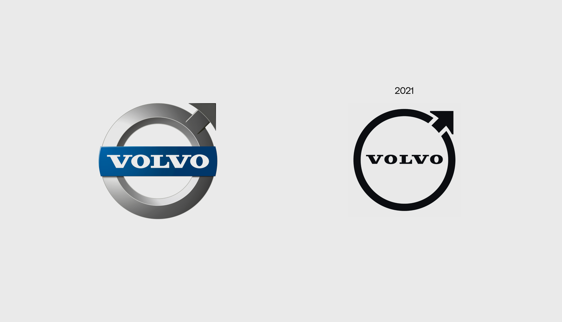
So, thisone is actually controversial. The reason? The symbol itself can quickly be identified as the male gender symbol, and many people complain that they should have used this opportunity to remove that and leave it just a circle, like millions of other companies.
Well, there is more to it than it seems, and being giving the opportunity myself I don´t really know how would I solve it.
Since the beginning the symbol looked like that, but the origins go back to the ancient way of symbolizing Iron, and Sweden works a lot with Iron.
If you google around you will find the classic alchemic symbols that were used in old times, and it looks exactly like the male symbol.
So, is there a solution? For now, they keep the same idea, make it flat, and connect in a nice way the circle with the arrow.
For me it´s nicely done. It doesn´t send away the controversy though.
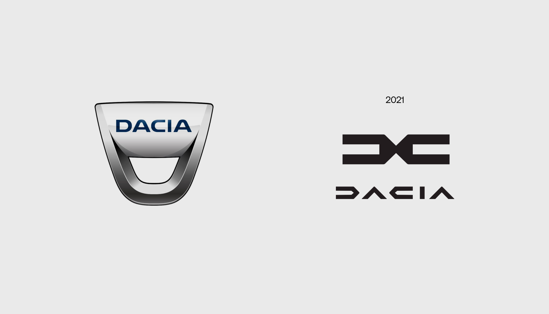
Renault little brother wanted to be exactly as cool, but in their own way. And If you see the new logo applied to the cars, It actually worked very good (maybe better than Renault itself?).
Here is a typical case of a small revolution instead of an evolution. The logo looks completely different. What you cannot do is dig deep in what the symbol is, because it´s either a mirrored D (from their new custom made typography), or a D and a C (wich wouldn´t make much sense). So, let´s think simple: it looks nice, and the cars look nice with it on them. If people can remember it after a while, I would say mission accomplished.
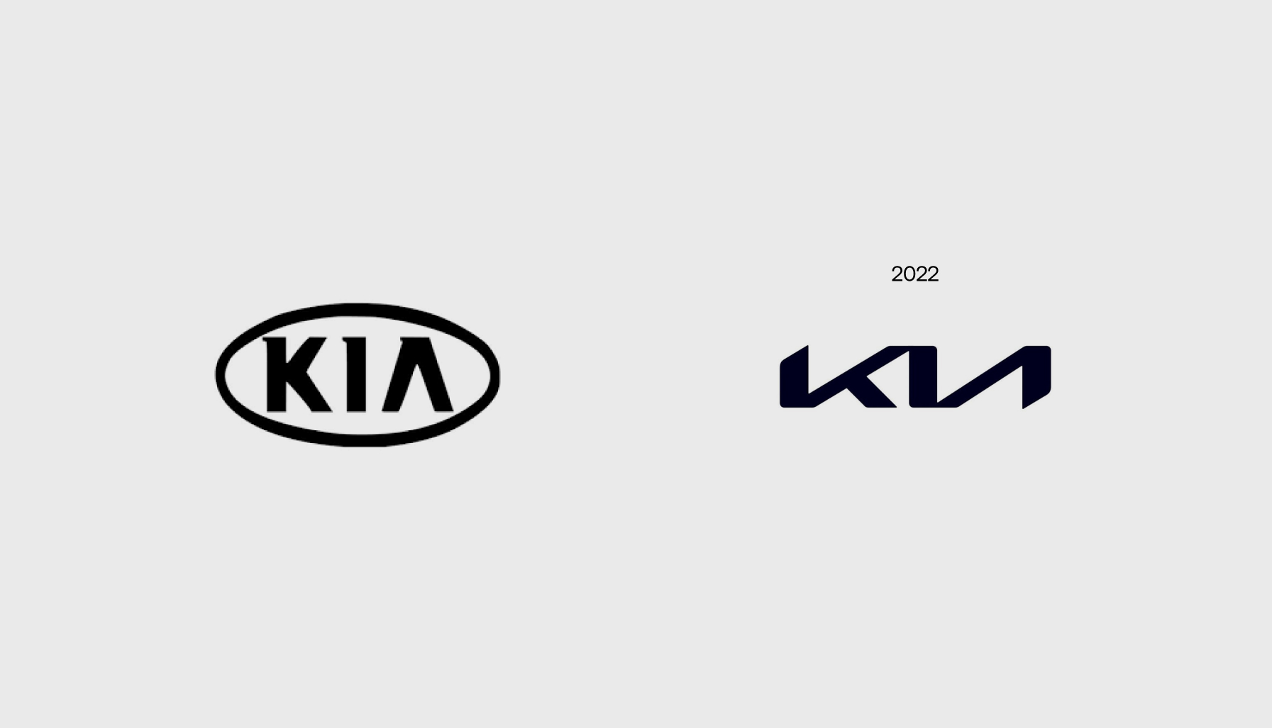
Well, well, well. Another controversy. The old logo looked quite good to be honest, but when the rebranding bug starts picking you, you end up having no other choice. The problem? The connection between the letters.
Let´s take a step back and talk about the positives. Diagonal cuts to the right defining movement forward, is always good. The rounding of the corners is also good. And if you realise that there are only 4 line directions (horizontal, vertical, diagonal right, diagonal left) and with those you build the whole wordmark, it´s pretty cool.
Going back to the issue: some people see "K-backwards N", others see "Kh" (weirdos), and others see a bunch of lines and don´t find the letters at all. There is actually a lot of people that google "KN cars" trying to find the brand. One thing we have to remember, is that if you already know the Kia brand, you won´t make that mistake, so at the end it´s only a new-customer thing. And, if many people are looking for their brand, even if they type the name wrong, they have done something right, right?
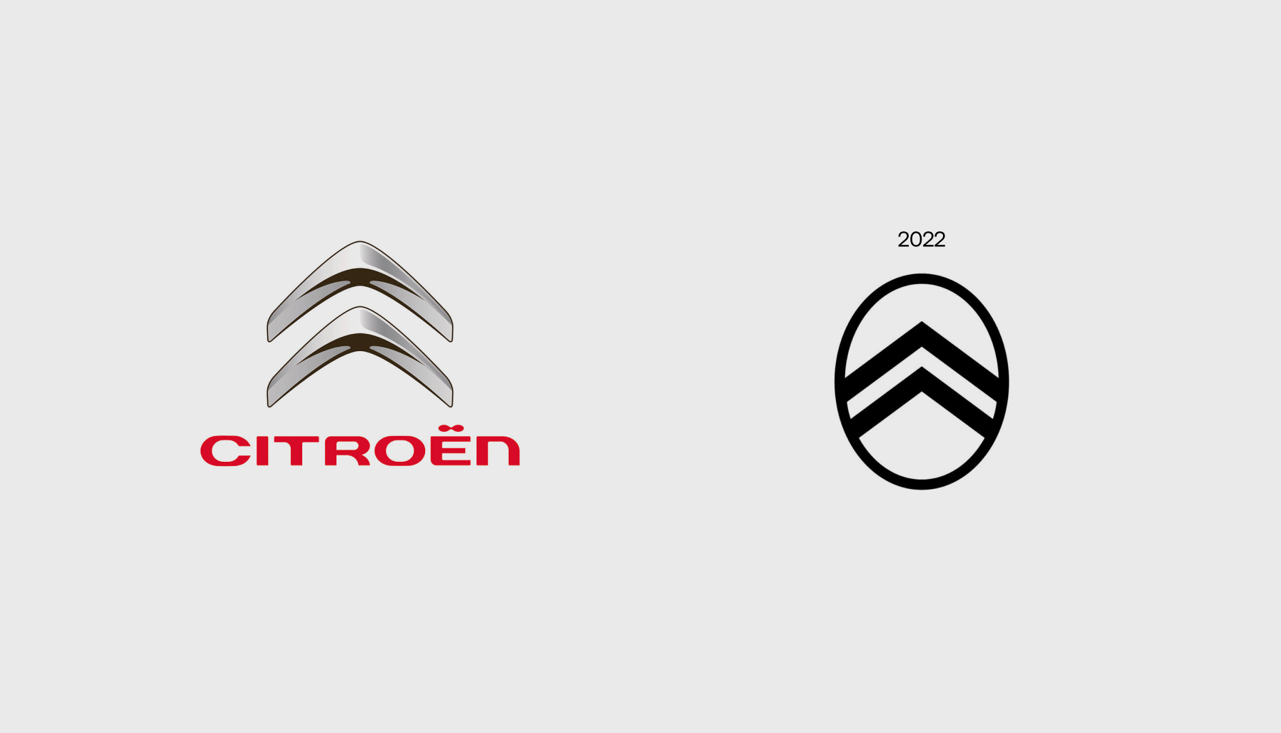
If the task was making the new cars look a bit more like a chinese brand, it worked. The biggest problem with this symbol it´s not the shape, but the way they decided to apply it to the new cars. We have only seen it in the new ë-C3, and its hughe, and ugly. You probably guessed my personal opinion. It´s a shame because on the website looks very good, but at the end you are going to see your car every day, and the website only when it brakes, or when you want to change it for another one.
Also, there is a weird feeling about this. Unlike with the Nissan logo or even the Renault one, you have this sensation of already having seen this logo somewhere else. That is not something you want to produce in the people seeing your newly rebranded ads.
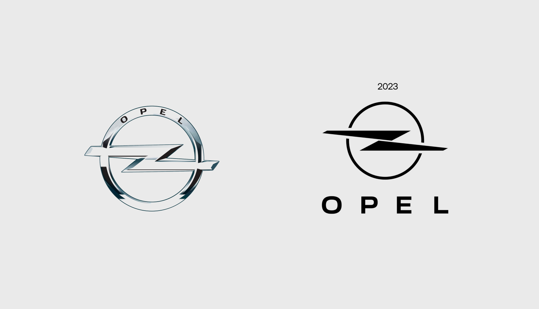
This case will also be charged with a bit of biased opinion. I don´t like it.
The reason is, Opel made a perfect rebrand some years ago. It was the perfect example of keeping the old ways and history of the brand. But then, they wanted to electrify it. There fact that they separated the horizontal lightning making it two long triangles is disappointing, and for some reasong the wordmark doesn´t seem centered. Many designers are still electrified by this decision, but they went with it, and now we have it in the new cars. Sadly, I don´t see them going back to the good logo, so we will need to get used to it.
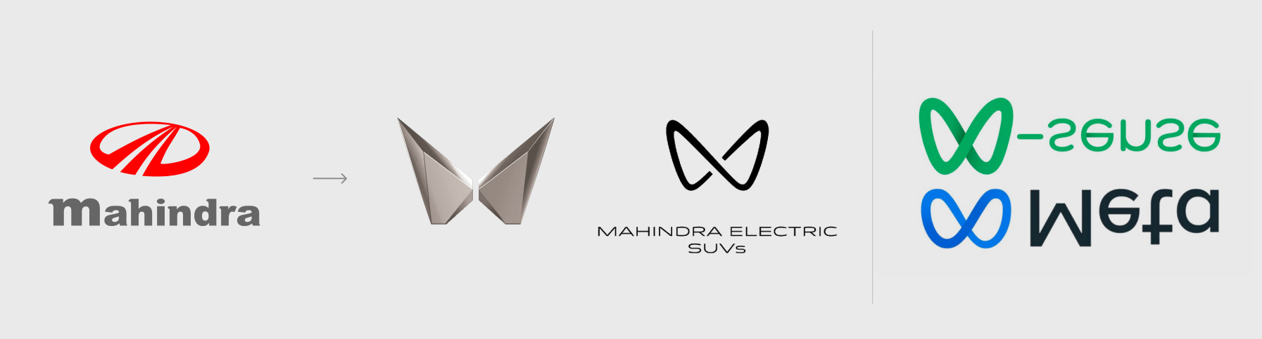
Mahindra is going through a difficult fase of redifining themselves. That´s why they have currently two new logos. One, so minimalistic that doesn´t say how they are called, the other, so expected that actually got in the middle of an infinite discussion between -Sense and Meta. I won´t say much about this, because I don´t like either of them, but I will say that at least it´s the only brand that tried to go in the opposite direction, deflatting their logo, and going 3d. Nice try, looks weird, try again.
There are other brands that also rebranded. Great examples like Audi, or other examples like the ones I show you here.
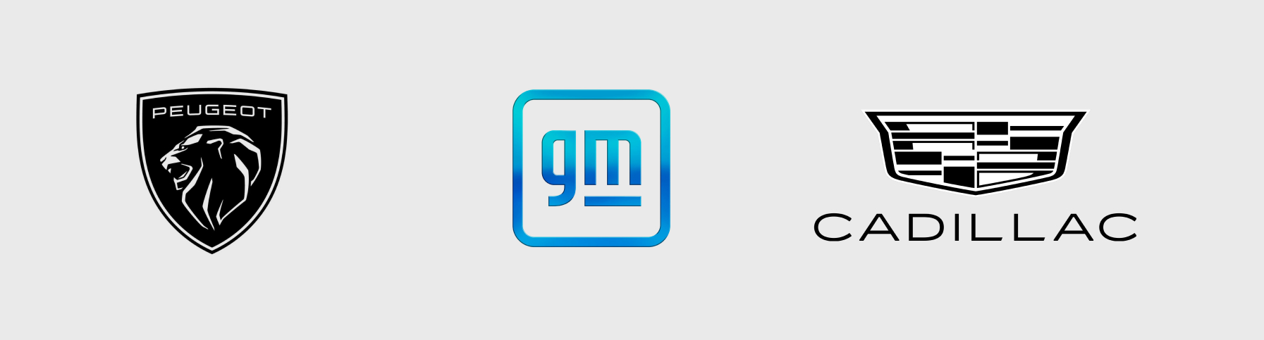
A quick round of opinion. Peugeot: Missed chance, looks terrible, and in the cars looks even worse. GM: The flat version is ok, the gradient one is a nice joke. Photoshop had at a time styles that you could drag and drop into a shape. This is it. Cadillac: The font is cool, the symbol was already complex, and without color looks even more complex, but at least you can put it nicely on the header of your website