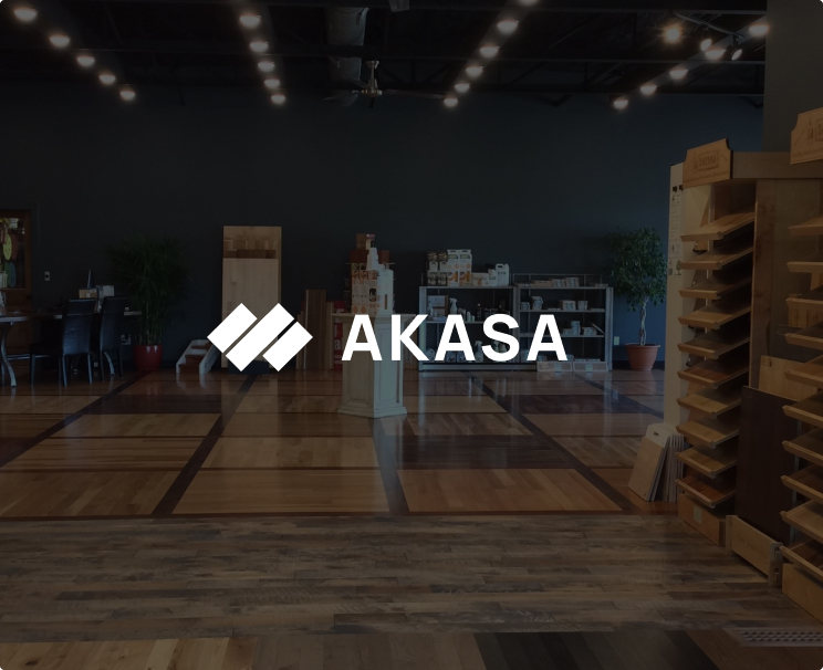
Akasa

Parquet and wooden floors from the best European factories.

They already had incredible wooden floors, they only needed a fitting corporate identity, and we worked together for some weeks to deliver exactly that. The result: awesome.

THE TASK

Create a brand that reminds you immediately of wooden floors. Make it simple and clean.

One of the most complex things about branding is to make something that does not exist in a similar way. So when I came to this idea, i went quickly to check out if there was a wooden floors brand out there that looked like this. Surprisingly, it was not the case.

THE KEY

The color palette should express the good quality of the products. We want to include Gold, is that possible?

Just find a nice typo for us. The thing with typography is that we need to find the perfect match for the whole concept. In this case we managed to do so and the Manrope shows how well it works in different environments.
very nice, very nice...

Almost ready to hire?
Let´s talk