Asker Nett

Electric design for one of norways most sucessful energy providers.

Asker Nett had a classic brand design, that quickly went old and they realized the importance of it in a modern corporation. We worked together well and ended up defining a lightning-bright concept that put together a vibrant color palette and a group of shapes that summarize the values of the company.

THE TASK

Carefully crafted

Simple yet powerfull the icon representing Asker Nett is timeless so we will be seeing it for quite some time out there.

THE KEY

Diagonal and vertical lines form the lightning shape.

It gives us many different ways of combining them to create more dynamic content. Either monochromatic or in full color the whole concept plays wonderfully together. Its vibrant, clean and modern.
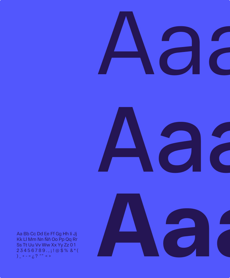
The RF Dewi does a wonderful job pairing with the color palette.
very nice, very nice...

Almost ready to hire?
Let´s talk